
Ask a small business owner what their brand is, and most will point to their logo. That’s understandable — the logo is the most visible part of any business. But a logo on its own does very little actual work. What builds recognition and trust is everything around the logo: the colors, the typography, the tone of voice, the photography style, and the consistency with which all of it shows up everywhere customers find you. In other words, brand identity for small business is not a luxury or a design indulgence. It’s the practical system that makes every rupee you spend on marketing work harder.
Key takeaway: Your logo is one ingredient, not the whole recipe. A strong brand identity — consistent colors, typography, imagery, and voice across your website, social media, packaging, and signage — is what makes customers recognize you and trust you. For small businesses this matters more, not less, because you don’t have a massive advertising budget to compensate for a forgettable or inconsistent presence.
Brand, branding and brand identity are three different things — and mixing them up is where most small businesses waste money. Brand is the reputation you earn, branding is the work you do to shape it, and brand identity is the visible system — logo, colours, typography, imagery and voice — that makes it recognisable. Our guide Brand vs Branding vs Brand Identity: What’s the Difference? (https://apexagon.pk/brand-vs-branding-vs-brand-identity/) untangles the three in full; this article focuses on building that system, step by step.
What Brand Identity for Small Business Actually Includes
A complete brand identity has a handful of practical components. None of them require a big budget. They require decisions — made once, written down, and followed.
Color palette
Two or three core colors, plus one or two supporting tones. These should appear everywhere: your website, your social media posts, your packaging, your shop signage, even your invoices and your WhatsApp Business profile. When a customer sees those colors, they should think of you before reading a single word. Pick colors you can live with for years, not just this season’s trend.
Typography
One font for headlines, one for body text — chosen once and used everywhere. Mixing five different fonts across your Facebook page, your website, and your printed flyers is one of the fastest ways to look amateur, and it’s entirely avoidable. If you communicate in both English and Urdu, make sure your chosen fonts support both scripts cleanly.
Logo usage rules
Where the logo can and can’t go, minimum sizes, which backgrounds it works on, and what you must never do to it (no stretching, no recoloring, no drop shadows). A logo that gets distorted or recolored by every new designer or printer undermines everything else you’ve built.
Imagery style
The kind of photos and graphics you use. Bright and energetic, or calm and premium? Real photos of your actual products and team, or polished stock photography? There is no universally right answer, but there is a wrong one: no answer at all, with every post looking like it came from a different business.
Voice and tone
How you write and speak as a business. Formal or friendly? Playful or serious? Short and punchy, or warm and detailed? Your captions, your website copy, and the way you reply to customer messages should all sound like the same business talking.
A simple one-page guideline
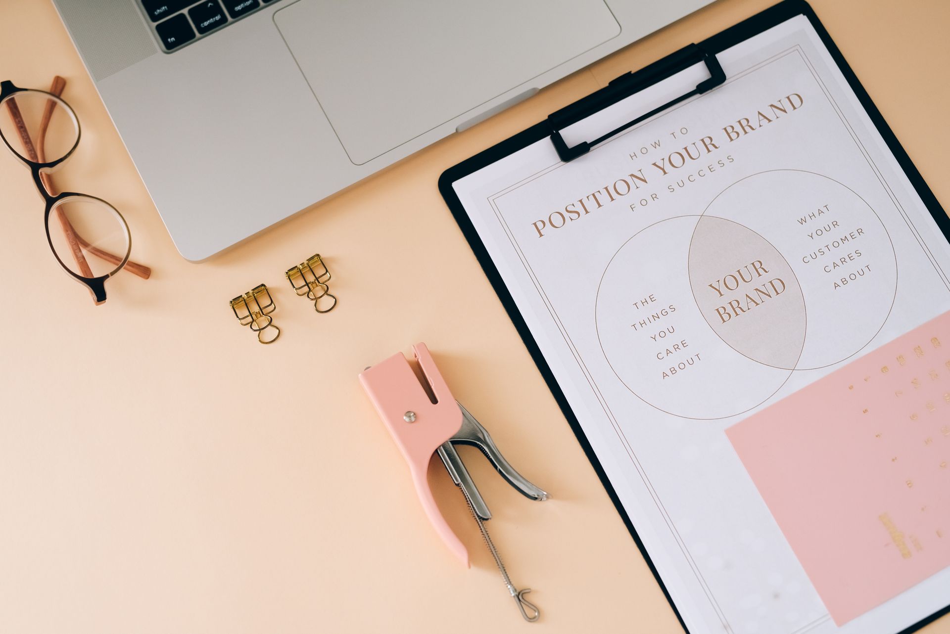
You don’t need a sixty-page brand manual. A single page showing your logo, your colors with their codes, your fonts, your imagery direction, and three or four do’s and don’ts is enough for a small team — or a rotating cast of freelancers — to stay consistent.
Why Consistency Builds Trust (and Inconsistency Quietly Destroys It)
Customers rarely analyze your branding consciously. They feel it. When your Facebook page uses one set of colors, your website uses another, and your shop signboard uses a third, visitors sense disorganization even if they can’t articulate why. That vague unease translates directly into hesitation: is this business reliable? Will my order actually arrive?
Consistency does the opposite. When every touchpoint looks and sounds like the same business, customers start recognizing you instantly. Recognition breeds familiarity, and familiarity breeds trust. That trust is what makes someone choose your boutique over the one next door, or reply to your quotation instead of your competitor’s.
This effect is stronger for small businesses, not weaker. Large companies can afford to be sloppy in one corner because their sheer visibility compensates. A small business gets fewer chances to make an impression, so each one has to count. A coherent identity makes a five-person company look established, deliberate, and safe to buy from — which is precisely what a cautious first-time customer needs to see.
Where Small Businesses Typically Go Wrong
The same patterns come up again and again with businesses at this stage. See if any of these sound familiar:
The logo-only trap. The entire branding budget goes into a logo, and nothing else. The logo then appears in slightly different colors on every platform, because no color codes were ever defined and everyone eyeballs it.
The DIY drift. A relative designs the logo, a freelancer builds the website, and the owner makes social media posts with whatever template looks nice that day. Each piece is fine on its own; together they look like four different businesses that happen to share a name.
The trend chase. Redesigning every year to follow whatever style is fashionable. Consistency compounds over time — every redesign resets that compounding to zero and confuses the customers who had just started recognizing you.
The “we’ll fix it later” pile. Mismatched signage, packaging that doesn’t match the website, a Facebook page that looks nothing like the Instagram account. “Later” rarely arrives, and meanwhile every single customer sees the inconsistency.
None of these are failures of effort or ambition. They’re what happens when brand identity is treated as decoration instead of infrastructure. The fix is rarely expensive — it’s mostly about making a set of decisions once and then refusing to drift from them.
How to Start Building Yours (Without a Big Budget)
You don’t need an agency-sized budget to get this right. You need a clear process and the discipline to follow it:
- Define how you want to be perceived. Pick three adjectives. Reliable, modern, friendly? Premium, precise, calm? Every decision after this one — colors, fonts, photos, wording — should serve those three words.
- Lock your colors and fonts. Choose them deliberately, write down the exact color codes and font names, and don’t deviate. This single step eliminates half of all inconsistency.
- Audit every touchpoint. List everywhere customers encounter you: website, Instagram, Facebook, TikTok, WhatsApp Business profile, packaging, shopping bags, signage, uniforms, invoices, email signatures. Bring each one into line, starting with the places customers see first.
- Create the one-page guideline. Logo, colors, fonts, imagery direction, voice notes, and a few do’s and don’ts. Share it with anyone who creates anything for your business — designers, printers, social media managers, even the signboard painter.
- Review quarterly — for drift, not redesign. Don’t change the identity; check whether anyone has drifted from it. Are the social posts still on-palette? Has someone stretched the logo on a banner? Catch it early.
If that sounds like a lot to manage alongside actually running your business, that’s exactly what professional branding and creative services exist for: getting the system right once, so that everything after it becomes easy. And since your identity has to live on your website and across your social media presence, it’s worth building it with those channels in mind from the start rather than retrofitting later.
The Bottom Line
A logo is a starting point, not a finish line. The businesses customers remember and trust aren’t the ones with the cleverest logos — they’re the ones that show up recognizably and consistently, everywhere. Build the identity, write down the rules, and follow them. It’s one of the highest-return investments a small business can make, and most of the cost is discipline, not money.
If you’re ready to build a brand identity that works as a complete system — not just a logo file — start a project with us. We’ll help you define it, design it, and document it, so your entire business stays consistent no matter who creates what.